Foreword
|
Nine months later, I had developed "Jaxogram", one of the first paid application
submitted to the Firefox Marketplace.
At this time, I had acquired a better knowledge of HTML 5 and CSS 3.
and the Firefox OS tools started to reach an outstanding quality level.
Although I don't feel anymore a newbie, I'm still reticent at using
JQuery, Ajax, ….
I want to keep a pure ISO-blessed attitude.
One of the criteria in developing "Jaxogram" was to obtain an User Interface
as close as possible to the recommendations of the Firefox Designers, the
Firefox OS Look'n Feel.
I followed the Building Firefox OS
(BFFOS) guide, and added the "glue" between the blocks, to make them playing
in a more collaborative way.
In this chapter, I tried to make a synthesis of the techniques I applied,
and determine to my best key points or generalizations suited
for most FxOS applications.
git clone -b gh-pages https://github.com/Jaxo/fxosstub
|
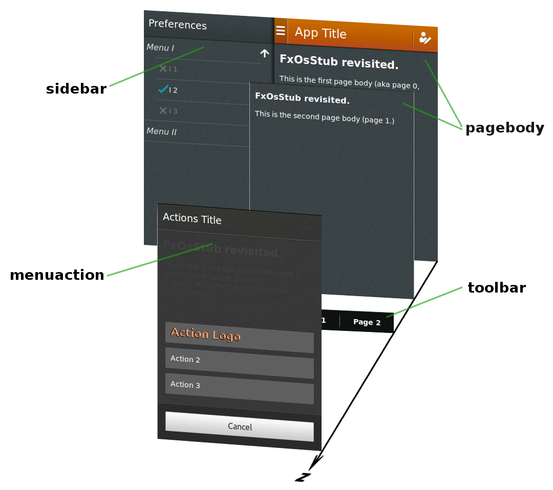
A more elaborate App Template.
The HTML skeleton
<body>
<section class="principal">
<header>
</header>
<div id="page0" class="pagebody" aria-expanded="true">
</div>
<div id="page1" class="pagebody">
</div>
<footer class="toolbar">
</footer>
</section>
<section class="sidebar">
</section>
<section class="menuaction">
</section>
</body>
|
|
Basic Rules
- There are 3
<section>'s of class
principal,
sidebar, and
menuaction;
- the
principal <section> has a
<header>, followed by 1 or more
pagebody <div>, followed by a
toolbar <footer>; its size is the device size;
- each
<section> has a header;
the sidebar <section>, for example, is followed by
<header><h2>Preferences</h2></header>
-
a
pagebody <div> may have its own header,
superseding the application default header;
-
a
pagebody <div> should define
its corresponding toolbar, using an aria-owns attribute;
for example, the page0 <div> is declared as
<div id="page0" class="pagebody" aria-owns="tb0" aria-expanded="true">
tb0 identifying the ID of the corresponding menu
<menu
- an
actionmenu <section> overlays
the principal <section>;
- the
sidebar <section> acts as a drawer,
"pushing" the principal <section> to the right;
I tried hard to make this structure simple and easy to remember.
No use of <article>, <aside>…
IMHO, the W3C is not crystal clear — and could it possibly be,
HTML being, by essence, a whole-purpose document type?
Not wanting to open a can of worms, I decided to go
“Keep It Simple, Stupid”, aka,
“good enough is good enough”.
Although, that may slightly change in the future.
The United Blocks of Firefox OS :-)
Keeping the same approach as in
BFFOS,
each CSS files represents a "block" (name it "widget", if you prefer.)
However, these files are not fully, but reasonably independent
one of each others.
A minimal dependency is required for maintaining consistency among the several
parts, not only for reaching some unity in the resulting look'n feel,
but also to define and reuse style definitions.
The latter minimizes the code, eases maintenance and changes, would allow
later to create "skins".
Take "icons", for example. These are used in several places, and it would
be no-sense to use different icons for <menuitem>'s or <header>'s.
Here is the list of our "widgets" CSS files:
- icons.css
- principal.css
- header.css
- toolbar.css
- sidebar.css
- menuaction.css
- menulist.css
- pagebody.css
I really did appreciate the BFFOS approach to avoid all procedural, keeping
just the descriptive part.
However, in the "real reality", we have to define
what logical interaction events do trigger.
Hence, some Javascript is required to show the interaction between blocks:
I attempted to shorten it as much as it was possible.
Considering "install.js" and "dispatcher.js" are apart,
all js/*.js files are pretty basic…
at the exception for js/menulist.js
for which a "longer" javascript was required for showing nice transitions.
Building our App, Step by Step
Step 1 - A "principal" section with a header
This is the most simple page: a <section>
of class “principal”,
with a <header>.
In this header, the <button> element corresponds to the
button on the header's left side. It has a typical layout, as shown
here, in Building Blocks.
The
Mozilla site
describes the headers characteristics:
- A header is a horizontal bar the full width of the screen, which appears at the top of the screen in most apps.
- Headers float above content, with the option of flowing with content in special instances, such as in the Browser app.
- The heading's text provides the name of the current view.
- The heading may optionally include additional text; for example, in an email app, the number of unread messages may be displayed.
- Headers may include inputs for navigating and manipulating the current view.
- Most apps (full-screen games being an obvious exception) have a header.
The optional "inputs for navigating and manipulating the current view"
are the <li> children of a <ul> element.
Finally, the <button> and the <li>'s
elements might contain icons images, rather than text.
For this purpose, the element is assigned to
a class "icon", followed by the name of the icon.
The list below shows the icon names that have been actually defined.
It contains at least all "Standard icons buttons" as prescribed
by Mozilla/Firefox designers and some others added because it was required
for our demos.
These icons were copied from the
Mozilla site, however the CSS techniques BFFOS used for representing icons
have drastically changed during 2Q 2013.
This list contains much more icons, and some names may differ.
Step 2 - Adding a toolbar
Adding a toolbar is just to include the appropriate style file
(toolbar.css) and add a <footer>
containing a <menu>.
In turn, the <menu>, of type toolbar, contains
one or more <li>'(s) elements to indicate each relevant action.
However, could a toolbar be one and unique for the whole life of
the application?
Certainly not.
A toolbar is context-driven.
It must adapt to the context in which it is shown.
Taking a look at what the
Mozilla site
says about toolbar's characteristics:
- Toolbars are always the full width of the screen, and are always the same height.
- Toolbars never scroll with content; instead, they float above content.
- Toolbars should always be positioned at the very bottom edge of the screen unless tabs are also present, in which case the toolbar is positioned at the top of the screen instead.
- Toolbars may contain a wide variety of elements, including buttons, filters, progress/activity indicators, and so forth.
-
"Toolbars never scroll with content, are positioned at the bottom":
toolbars are children of a
<footer>element;
-
There can be several toolbars, and a mean is needed to know which one
is selected:
the
<footer class="toolbar"> element
must be able able to collect several <menu>'s,
the "arial-expanded" attribute of each telling which is the currently
selected one;
-
The selection of a toolbar is hooked to a "context",
but what is a "context"?
We define it as the "body" of the
principal <section>.
It (aria-)owns the toolbar, as explained next.
Step 3 - Where is the Beef? A Pagebody div in the Principal Section
Up to now, the examples picture only the decorations around the main content
on the screen: header and toolbar.
The main content is represented by a <div> of class
"pagebody", a child of the principal <section>:
Step 4 - Multiple Pagebodies and Multiple Toolbars
Applications typically involve more than one single "page", and
this is especially true when the size of the screen is a scarce resource.
Press on the "Go to Page 2" toolbar item in the example below.
Versus the previous example at Step 3,
there are 2 pagebody <div>'s,
and 2 <menu>'s in the toolbar <footer>.
One can add here as many pages and toolbars as necessary.
Here is how the page switch works:
-
the menu item "go to Page 2",
child of the
<menu> with "id=tb1",
(aria-)controls the element with "id=pg2";
-
the element with
"id=pg2" is the pagebody <div>
containing the Page 2;
-
the
pagebody <div> containing the Page 2
(aria-)owns the element with "id=tb2";
-
the element with
"id=tb2" is a <menu>,
a child of which is the menu item "go to Page 1";
-
when "Page 2" is displayed, the
<menu> containing
the menu item "go to Page 1" will show up.
For all other preceeding examples, no javascripts were needed.
This time, the "click" event has to be handled to produce an appropriate action
and javascript is required.
As for the CSS style, JavaScript code has been parceled out so that each
file relates to a widget.
The <header> of this example declares 2 script files:
- pagebody.js
contains a function for revealing a given
pagebody;
it also activates the aria-expanded pagebody at the start;
- toolbar.js
contains a function for showing a given
<menu>;
it also ties the click on a menuitem to the action of revealing
its aria-control'led pagebody, if any.
Step 5 - Autarchic Pagebody, how Chic!
Besides the pagebody <div>'s ability
to define its own toolbar, it also can define its own header.
This feature is required for "accessory pages" or "sub pages",
that is, pagebodies pertaining to the principal
<section> although introducing a different situation.
The overriding header follows same structure as the principal,
overridden one.
Most often, the left button is either for "cancel" or "back",
the right button being for acknowledging.
Step 6 - Sidebar: The Bar Next Door
A sidebar is an "accessory page", a <section>
distinct from the principal <section>.
It is represented as a sort of "drawer", putting away the
principal <section> when pulled.
Restarting from the 1st example (at step 1),
-
the style and javascript for the "sidebar" is added
inside the
<head> element;
- the
sidebar <section> follows
the principal <section> inside
the <body> element;
-
the
<button> in the <header> has an
id="sidebar_trigger" to tie a click to the action
"expand the sidebar".
That is all what is needed.
The sidebar.js
script contains a function for expanding/collapsing the sidebar and
ties the click on the id="sidebar_trigger" to this function
when the web page loads.
Step 7 - Lights! Camera! Action Menus!
As for the sidebar, an action menu is a <section>
distinct from the principal <section>.
Press on "Action!" in the toolbar below…
The
Mozilla site
describes the headers characteristics:
- Opened from buttons within app content; these buttons are often inside toolbars (for example, the Browser app's "Share" button).
- Action menus contain one or more items.
- These menus expand in height to accomodate their items, to a maximum of the screen's height. Once that maximum height is reached, the content becomes scrollable vertically. Generally, the best practice is to try to include no more than five items plus a menu title.
- The title string is optional.
- The menu is closed by one of:
- Selecting one of the actions.
- Tapping the "Cancel" button.
Notice that one menu item contains a logo by just specifying
icon="actionLogo.png", where "actionLogo.png" is
the filename of the icon image.
Step 8 - Drop It Down: Menu Lists
A Naked MenuList
Baring the menu list — that is, exposing it outside a principal section,
toolbar, sidebar, etc. — serves 3 purposes:
-
first is to let you play in the menulist sandbox, w/o being disturbed by
the context;
-
second is to prove the reusability in using self-contained widget, style and js;
-
third is that it was too long to show a full source, and impacted the
understandingness of the example.
Here we go: spend 2 minutes pressing on the items, expand them all, etc.
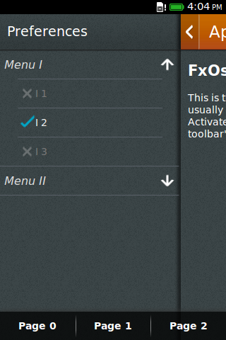
A Real Example: Preferences Sidebar
A "Preferences" sidebar is obviously a good candidate
for a menu list.
The sidebar <section> contains
a <header> and a <div>
of class menulist, with the same contents
as the previous example.
Observe the slight transparency of the toolbar,
which appears to hover the sidebar.
And also: when the list item overflows the size of the screen,
a vertical scroll bar pops up on a desktop computer.
On a mobile device, the scroll bar won't show up:
scroll is accomplished by a natural bottom-up swipe gesture.
No Step 9 - You're done…
- Here is the full demo
- The entire source code is under the directory
source/chapter_2
Additional Remarks
To Be Continued…
Hocus Pocus, Em, Rem, and Px: a word about units and auto-sizing
Install
Gesture
● ● ● ● ●